A while back I received a photography backdrop to check out from the company Photo Pie Backdrops, which is based out of Burley, Idaho. (Hey neighbors!) I’m finally just now getting a chance to check it out, and thought I’d write up a quick Photo Pie backdrop review since the company was kind enough to send this to me at no charge (thanks guys!).
Typically I don’t use a ton of backdrops since I generally don’t spend a whole lot of time shooting “set up” scenarios. What this means is that I’m usually photographing people in spaces without making any additions or adjustments of my own because I’m documenting them as they are. Or I’m shooting outside and don’t really need a backdrop (yay for Montana’s stunning natural backdrops! – holla!). However, every now and again it’s good to have a backdrop on hand to clean up a background or to help make a subject pop.
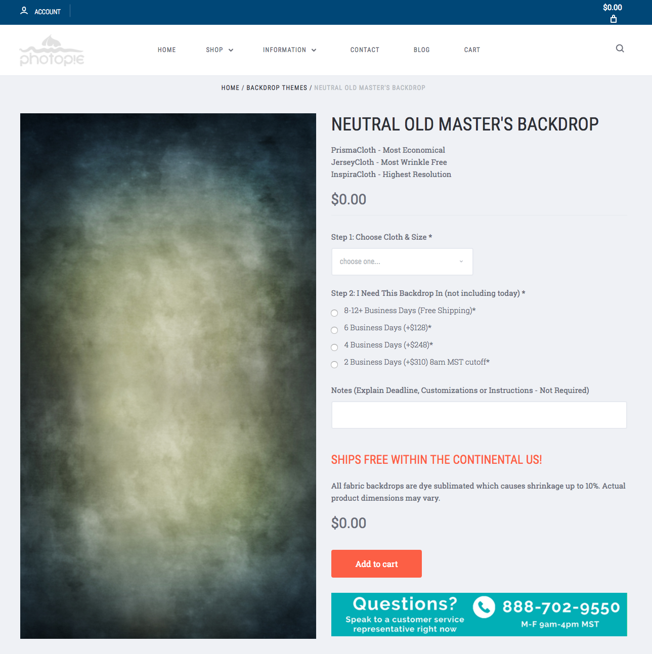
I opted for Photo Pie’s “Neutral Old Master’s Backdrop” since I just wanted something simple and classic. Upon receiving it, I opened the package, removed the backdrop from its zippered plastic bag and then set it up. I was actually pretty surprised at how green/blue it appeared since it looked as though from the photo on their website that it’d be more of a tan/gray combo (and I initially thought they had sent me the wrong one). However, it was indeed the correct backdrop and I can see that there are definitely blue/green tones in it that I simply just didn’t pick up on when I was perusing their backdrop options. Thankfully, this wasn’t a dealbreaker for me since I’m a huge fan of the blue/green shift that’s going on in this backdrop. (Though I would love to test out and shoot on a more neutral gray/tan option too!)
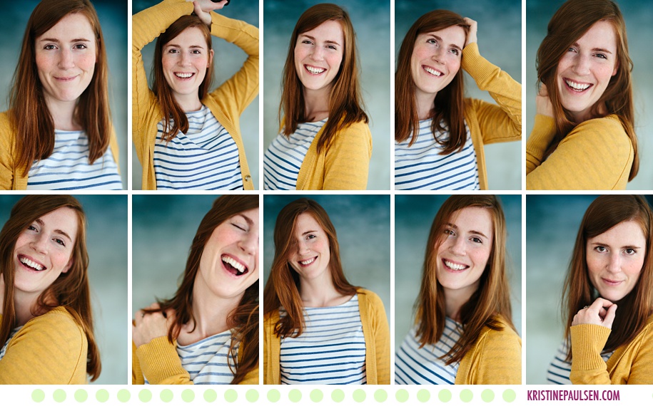
I did a quick self-portrait photo shoot to test out the backdrop (sorry that you have to be subjected to my crazy faces here, but self portraits are NOT easy to do – ha!).
Also, sidenote: my poor mailman seriously must think I’m some sort of special…the wacky laughing faces are *after* I realized what he’d just had to witness – and it’s not the first time this has happened – oh my!
You can see how nicely that green/blue shift moves through the background and how the subtle printed texture looks especially lovely in the bokeh of my lens. Not too much texture in the background and not too little – juuuuust right. A Goldilocks moment!
The backdrop itself is pretty standard, is well made, and has a pocket for hanging on a stand – I ordered the backdrop in the “jersey cloth” fabric option which boasts wrinkle resistance. According to Photo Pie’s website, their jersey cloth can be described as:
JerseyCloth: Similar to durable sweatshirt material (but not stretchy), JerseyCloth backgrounds offer a seamless, machine washable, the most wrinkle-resistant, more affordable, alternative to InspiraCloth. JerseyCloth is a heavyweight material with a soft, knapped backing. Colorfast image while still making it washable/dryable. Since it is made for photography, image surface has a non-glare matte finish. Because of JerseyCloth’s wrinkle-free nature, it can be stored folded, rolled, or stuffed in a bag/plastic crate. Comes with a top-side rod pocket, ships folded. If we could summarize its texture, JerseyCloth is: soft and flannely.
While I don’t agree that this is entirely wrinkle-free cloth (if it’s folded the fold lines will show, albeit not terribly badly), it’s still a nice fabric. And when storing this, I’ll likely roll it up to try my best to keep any wrinkles/folds out of it. It is definitely glare-free and that’s super important to me in a backdrop, so I certainly appreciated that. (Glare is a surefire way to destroy a good photo if you’ve got a backdrop set up behind your subject, and especially if you’re using off camera lighting!)
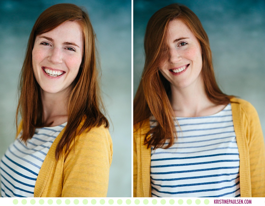
As evident in the shots above, that texture is really lovely and subtle and doesn’t overpower the subject.
The particular backdrop that was sent to me was the 8’x10′ size, so not huge, but not small either. Another thing I appreciate about this backdrop is its weight – it’s not crazy heavy and packs down pretty small, so it will be super easy to move from location to location, which is always a plus since it’s just me, myself and I schlepping my gear everywhere in my tiny car.
In the screenshot below, you can see what the backdrop looks like with the focus on it instead of the subject (i.e. it’s not fading away into the background). Also, check out the free shipping Photo Pie offers – if you don’t need a backdrop lickety split, then this is a really nice bonus as well since shipping can add up for heavier packages.
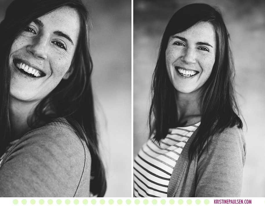
One of the other added benefits of this backdrop is how well it transitions over to black and white applications. That subtle texture looks really great in black and white as well and gives the image just another added dimension. It would feel pretty flat without that subtle texture provided by the backdrop.
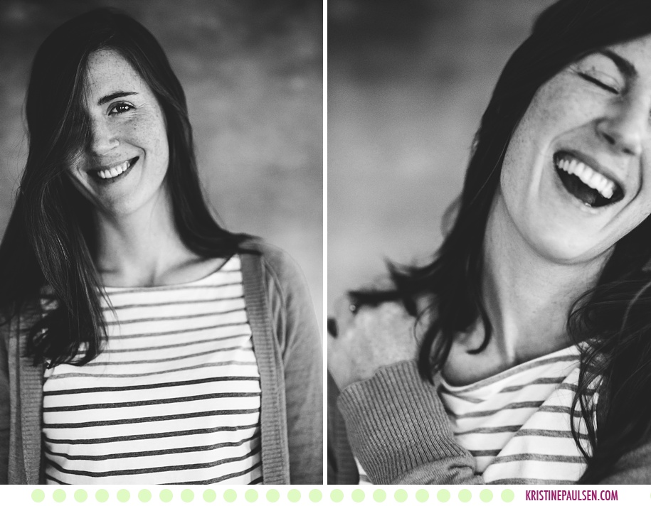
See how nice and subtle that texture shows up in the above-left image? And then how nicely it just falls off as the subject steps farther away from the backdrop? (See above-right image.) It looks good! See below for another black and white example (also, hellooooo freckles!).
All in all, I’m a fan of what Photo Pie sent me. As I mentioned before, backdrops aren’t a huge part of my photography workflow and don’t use them often, but I do appreciate the classic options, and will likely consider purchasing more from this company in the future (I’m particularly curious about their solid color options).
And now – back to your regularly scheduled programming! On the docket: portraits, editorial shoots and weddings! Stay tuned!
Cheers!
-Kristine
{ Book a Session with Kristine }….{ Join the Facebook page }….{ Visit the Website }
