The grass in my yard is about a foot tall. My garden is the definition of wild. I’m not entirely sure when I last cooked a real meal for myself. Suffice it to say, I’ve been busy. Editing photos, on shoots, out on photo-hiking-camping adventures in our beautiful state. Hanging with friends. Really making the most of summer and this gorgeous weather and all that comes with it. And, last, but certainly not least, in the free time I’ve found here and there in the very wee hours of the morning (because I will never not be a night owl), I’ve been plugging away redesigning my brand new website. And I. Am. SO. STOKED that it’s finally, finally live!
If you saw my initial post over on Instagram, I shared there that it’s been a work in progress for quite a long while. I think I might have been working on this new update for a couple years now. I swear, it wasn’t supposed to take this long. But the old website design program that I used (yes, I do all my own design – no templates here, no siree, Bob) pulled the plug on all its users out of the blue at the beginning of this year (ahem::coughcough::ADOBE). And they did it literally about a week before I was going to go live with my new design.
To say I was a little frustrated by that announcement is a bit of an understatement. There was much gnashing of teeth, clenching of jaws (wait a second, I only have one jaw!), and tearing of hair (ok, maybe not literally), and while that was beyond frustrating at the time, it ended up being a bit of a blessing in disguise. Turns out, I was able to find a much better, much more powerful program to use. While there was definitely a learning curve and a lot of trial and error in learning a totally new system from the ground up as quickly as I could possibly muster, it’s actually been (mostly) fun, mainly because packing the ol’ noggin with new stuff is kind of my jam. And voila! Now I’ve got a new website to boot! Those silver linings can be pretty darn nice sometimes.
So, I’d like to take a few moments and share some of my favorite little pieces from this new design, and include a little info about each, and invite you to go check out the new website for yourself, too! And, because this IS a business after all, I’m going to encourage you to share it with your friends as well, if you so desire. (And I do hope you so desire!)
Main Page Grid Load Up
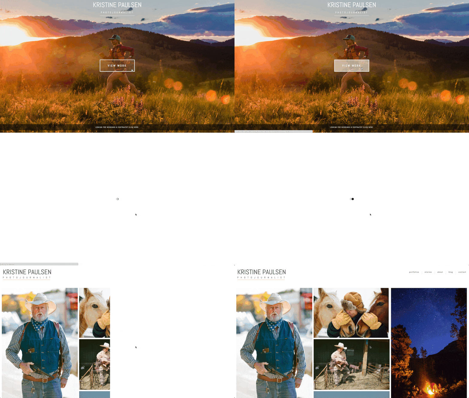
One of the main reasons I’ve wanted to do this redesign is to get rid of my old homepage/landing page because that thing was kind of hideous. It worked initially when I first made it, but it bothered me more and more as the years ticked by. So hooooo boy am I glad I changed it up, because I really dig the look of this one and think it makes navigating around my site a heckuva lot easier than it had been. And I kinda like how it animates in with the name of my business arriving to the scene fashionably late (yes, that is intentional).
Tagline
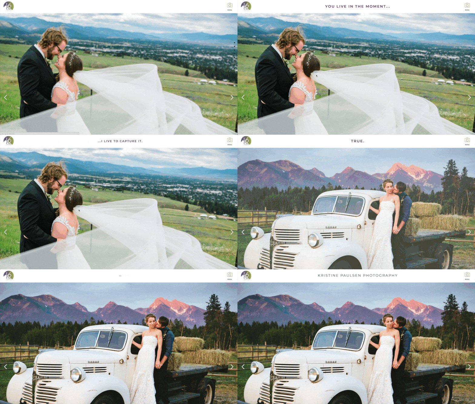
Another part of my redesign was done to ensure people know what I’m about immediately. And an essential element in making that happen was figuring out a way to include my “tagline” into my design where it would be immediately eye catching. I struggled with this for a bit when I was working on the overall design. Did I want to overlay that text somewhere? Something told me I should, but my gut reaction just felt like that was a little too on the nose, and I didn’t want that text to just SIT there and overtake my photos (you know, because the whole photography thing is kind of important, too). Then a lightbulb went on – what if I could ANIMATE my tagline and make it fly onto the scene, wow folks with its grand entrance, and then fade away after doing its job? Hence, the animated tagline was born. And I love it.
Camera Menu Button
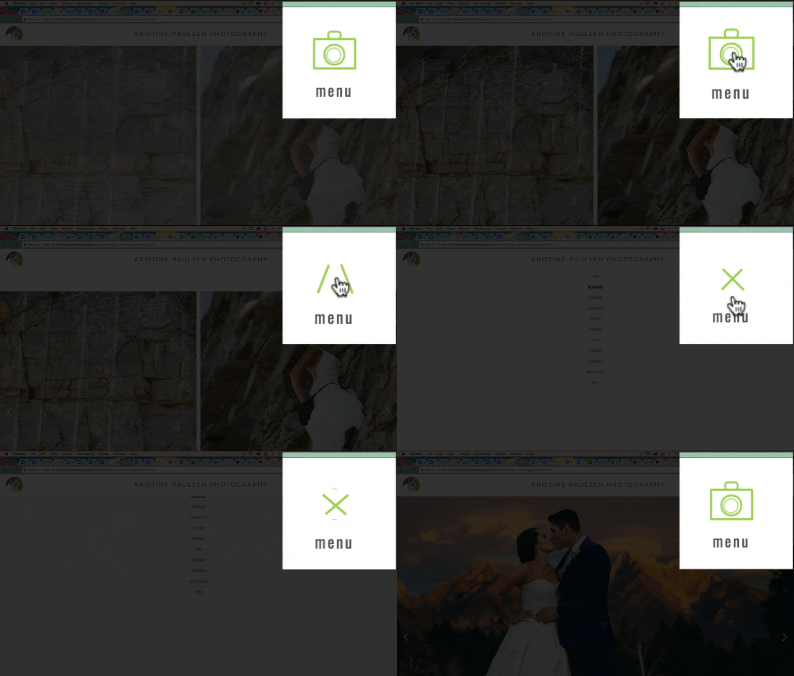
A lot of what makes good design, for me anyway, is paying attention to the small details. And I suppose that’s how I run my business too. I don’t like to let anything fall through the cracks. If I can make it better I will. And that philosophy held true for my menu button as well. For a long while it was actually a pretty boring little thing. It had the standard three, stacked horizontal lines with a hover effect of a standard hamburger menu icon. But that just wasn’t doing it for me for some reason. It was nice, but just not good enough. So I began to think. What would be fun? (Because I love fun!) What would be more engaging? (Because I love engaging!) And tah dah – the camera button came to mind. Now, you may look at this and go, no biggie. But let me tell you – there’s a lot of work that goes into that wee little thing. The whole button is built entirely out of lines and div blocks so it can be manipulated via a timed animation. Which means, when designing it, I needed to think “backwards.” As in, I knew I wanted the camera to turn into an X. So how do I build something that has components that can create an X, but also a camera at some point? Anyway, it’s a bit of a process, but suffice it to say it took some time, and I was pretty stoked when I got it to do what had been in my head. Yay for making a vision a reality! (Side Note: If you look closely there is a shameful number of browser tabs open in that screenshot. Haha! Anyone else as addicted to millions of browser tabs as I am? Eeeep!)
Side Nav Jump to Section
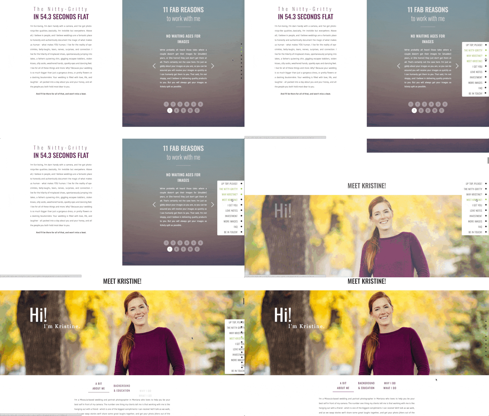
I also hemmed and hawed for a while about the actual structure of my site. Would I create separate pages for each of the different photograph genres I shoot? And then separate about and contact and investment (etc., etc., etc.) pages for each of them too? It just seemed like a boatload of pages that I probably didn’t need. So I figured I’d make a page for each genre and break it into its pertinent sections. But those long, scrolling pages can sometimes be a pain in the rear to navigate through if, let’s say, you’ve already read through the content, but you know you want to zip right back to the images section to look at those more closely. While I realize scrolling up a few inches isn’t really going to kill anyone or damage any sensitive scroll fingers, why not make it easier to navigate, and – here we go again – more fun?! So I decided to build side navigation. Now this thing…I think I may have blocked it from my memory…because it was fairly challenging to build and subsequently animate. There is a LOT that’s going on there. Links that need to hit certain sections and highlight depending on which section is active, the little dots need to fly in gracefully and land in the appropriate places, and it needs to be mobile-friendly as well. So it took a long time to build. But it’s functional, fun to use, and, I think, adds a nice element to the navigation of my page.
Clicked Gallery Images
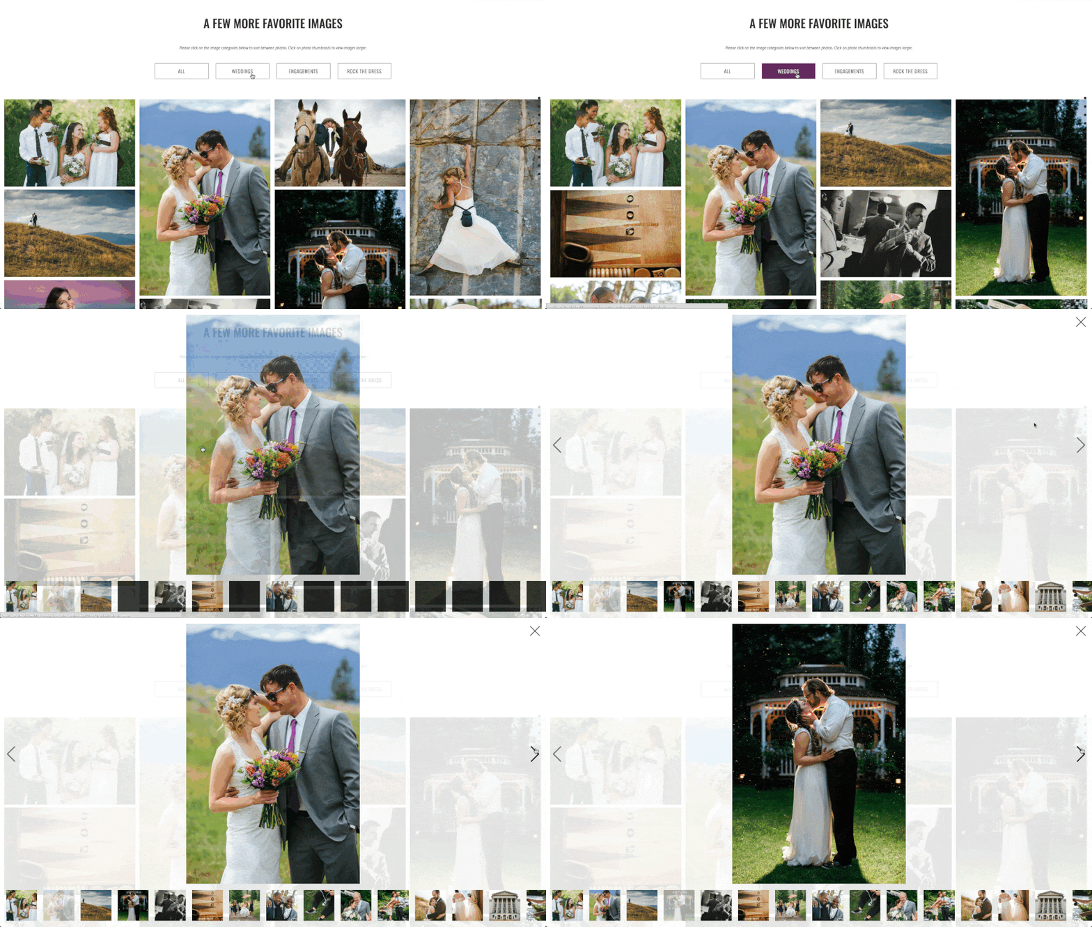
One of the main things I knew I wanted when making my new site was a really nice layout of some of my favorite images I wanted to highlight. While image slideshows have their purpose and are nice, sometimes those favorite images can get kind of buried. And it always tugs at my heartstrings a bit when a good image gets buried! (This must hearken back to my newspaper days when a story and its images would go from being slated for A1 front page and then get buried in the inside of the B-section somewhere. The ol’ heartstrings are a little sensitive! But, I digress.) Basically I wanted to show a nice chunk of imagery where you could visually see it all laid out, and where none of the images were cropped. (I’m pretty specific about how I shoot – I rarely ever crop my photos after the fact because I compose and “crop in camera.” So when an image gets its top chopped off or what have you, it just doesn’t look right to me.) I had to do a little digging to make this one work for me. It also required some code-work and quite a bit of finagling to get it to work EXACTLY how I envisioned, but I’m really happy with it now, and think it’s a good addition to my pages. I also wanted folks to be able to click into each of those tiled images to be able to view them “one-on-one” and see them a little larger if need be. This also required some code-work and a lot of finagling, but again I made it work and I’m glad I made sure to add this feature into the image sections as well.
FAQ Disclosure Arrow
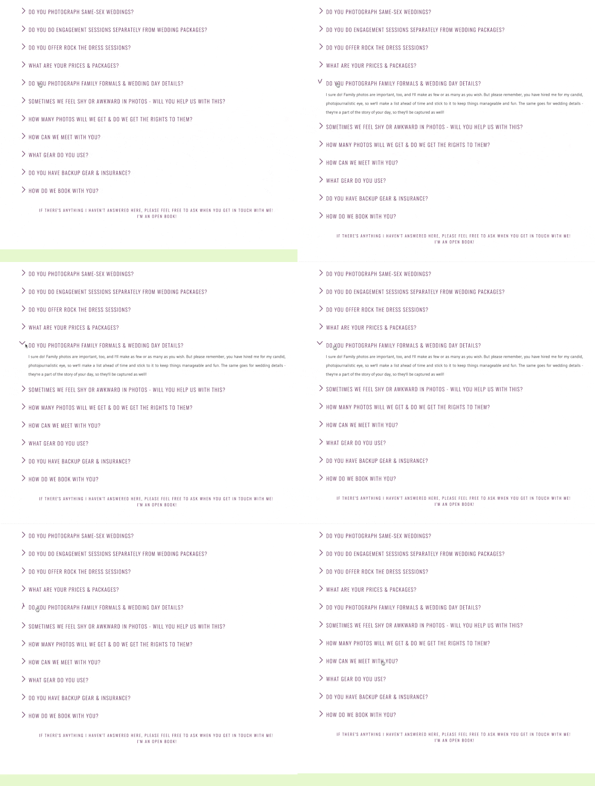
This one gets chalked up to one of those small features that maybe people will miss, but is an attention-to-detail kind of thing. FAQ sections can be kind of lengthy and miserable to look at since basically it’s just a giant wall of text. Most people take one look at a FAQ section and skip it entirely. So I wanted to make mine more engaging, and hopefully a little less text-wall-like. The expanding FAQ questions was something that also took quite a bit of time to create and finesse. But it’s worth it, in my opinion. I knew I wanted a smooth transition to the answer part of the FAQ, and I also wanted an arrow to indicate that it had been opened. Similar to the camera menu, this was all built with little div blocks that were then animated. And I kind of love them. I also sort of dig how they gently fly onto the page to sidle up to their corresponding question. Perhaps they remind me of little birds?
Bouncy About Arrows
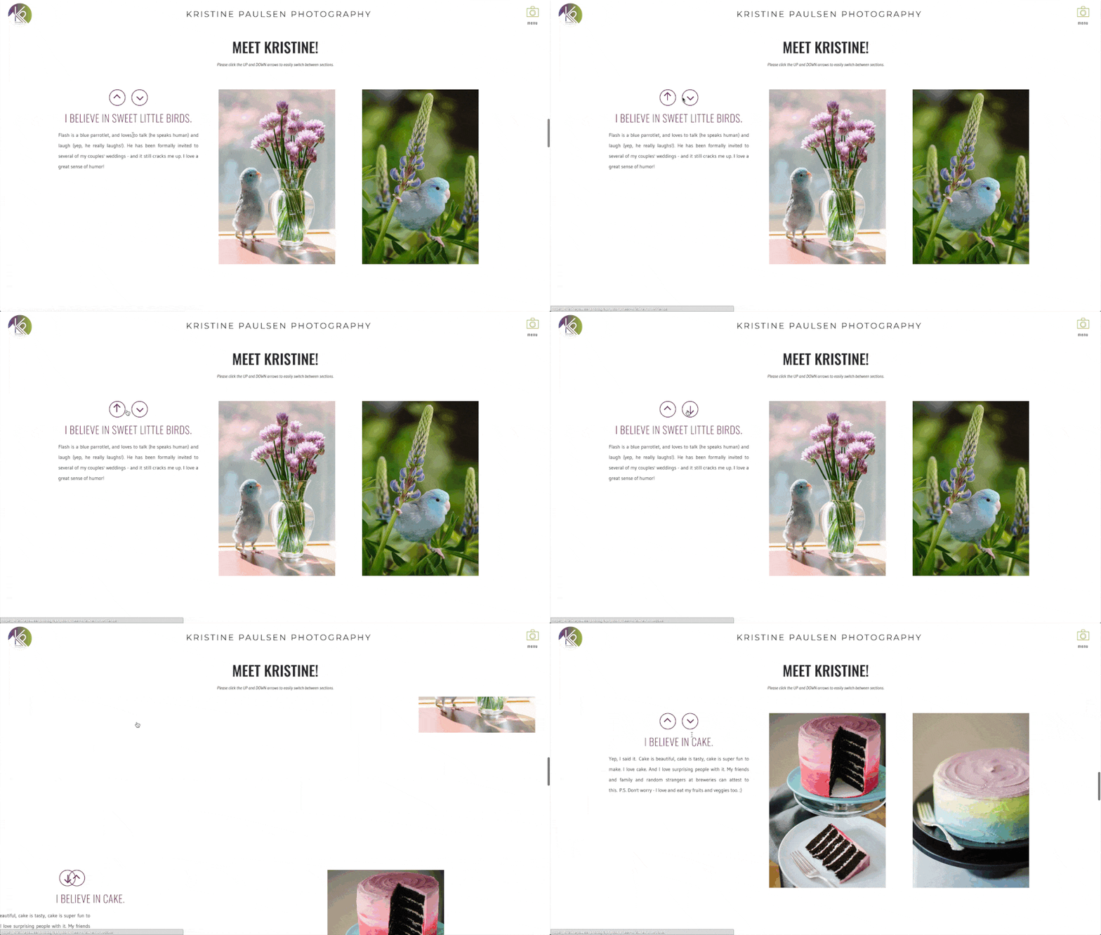
I love fun, interactive things. So I knew that when I was recreating my “About” page from my previous site that I wanted the up and down arrows to sport a bit more pizazz. Enter, bouncy arrows! These were also totally designed in pieces, and were pretty fun to get juuuuuust right (as Goldilocks might say). I’m still on the fence about the overall design of the Meet Kristine page, and I may change that in the future, but for now, it works, and the bouncy arrows just add a little extra shot of happiness. (I’m curious: what do you think about the Meet Kristine page? Like it? Hate it? Lemme know!)
Before/After Slider
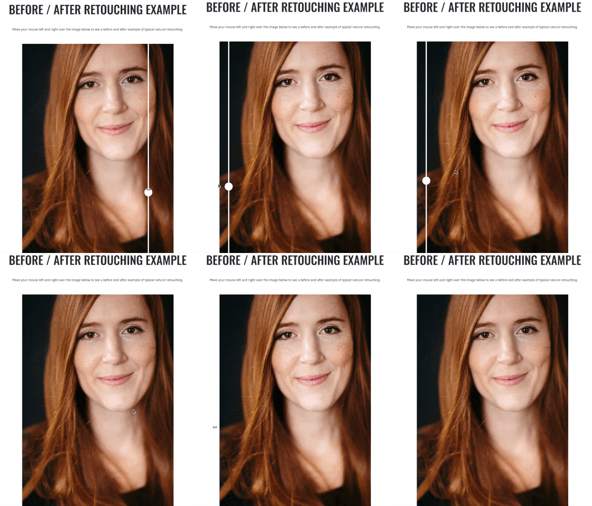
I’ve been wanting to make a before/after slider image for a long while now, and when creating my new Headshots page, I knew this is where that slider would live. I wanted to show folks how I retouch – subtly but naturally, so this was the perfect way to use this feature. And I think it’s pretty nifty.
Editorial Wipe Intro
Again, this isn’t a huge element, but it’s one of those attention-to-detail things. I brand myself differently for my editorial work, so I wanted the pages (and that “site”) to feel a little different too. Enter, the cool page wipe transition. It just adds a little more of a neat presentation when moving from page to page. Sort of like a semi-dramatic reveal. And I like reveals. And semi-drama.
Editorial Magazine Hover
There is such a thing as too much text on a page. I can definitely be guilty of this because: word-nerd. So when there’s something I want to put text on (which is usually), I try to think if there’s a way it can be included in a bit more of a subtle manner. That’s part of the reason I love these hovers over the magazine covers on my editorial page. They’re just kinda sexy, doncha think? (Can words and hovers be sexy? Discuss amongst yourselves.)
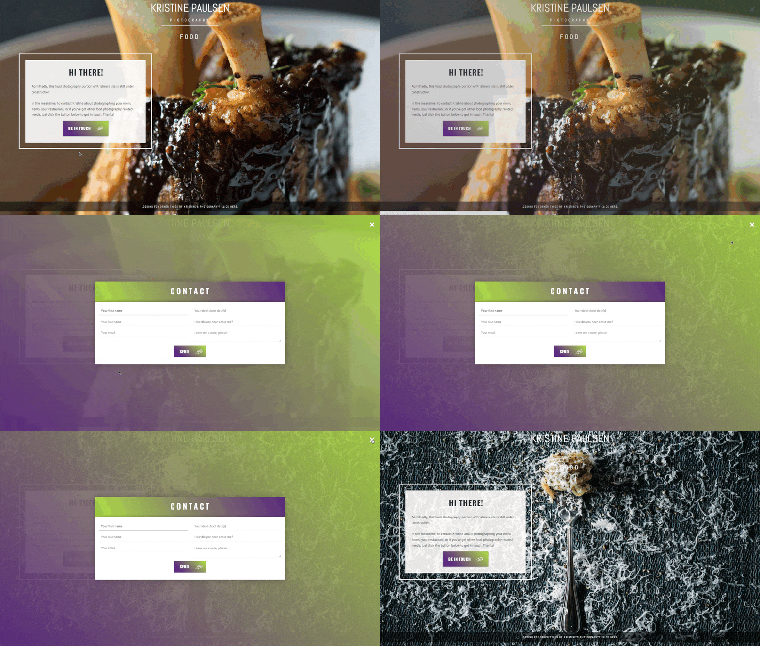
Placeholder Contact Modal
Last but not least is this little contact pop up modal. As much as I’d love to say that every last little square inch of my site is complete, it’s just not. And I knew I wanted it to go live way before I’d have a chance to finish up my last few pages, so I needed a placeholder of sorts for the pages that weren’t finished. But I also wanted them to look cool and still be fun to use. Enter, pop up modal. Kinda neat, eh?
So there you have it! A little behind-the-scenes into what I’ve been up to! Please, share with friends, and if you see any weird bugs or bad links or what have you, shoot me a note – it’s nice to know when things are misbehaving! (But hopefully that won’t be the case!)
On the Docket:
Weddings, portraits and elopements! Stay tuned!
Cheers,
-Kristine
{ Book a Session with Kristine }….{ Join the Facebook page }….{ Visit the Website }
